User Interface
Doriax includes a complete runtime UI system for menus, HUDs, overlays, and in-game controls. UI entities are regular ECS entities with UI-specific components and layout state. Because the UI system is built on the same ECS foundation as the rest of the engine, you can combine UI with 3D, 2D, and scripting seamlessly.
UI scenes
For anything beyond a single HUD element, put UI into its own UI scene and add it as a scene layer on top of your gameplay scene.
-- Startup: run gameplay and HUD simultaneously
Engine.setScene(gameplayScene)
Engine.addSceneLayer(hudScene)
This approach keeps gameplay entities separate from screen-space widgets, makes it easy to swap menus without touching gameplay data, and lets you load/unload UI independently (for example, showing a pause menu without reloading the game level).
Typical UI scene examples:
| UI Scene | Content |
|---|---|
| HUD | Health bar, ammo counter, minimap overlay |
| Main menu | Title, Play/Settings/Quit buttons |
| Pause menu | Resume, Options, Quit to menu |
| Settings screen | Sliders, dropdowns, back button |
| Dialog / modal | Confirmation popup, item description panel |
| Loading screen | Progress bar and spinner |
UI widget classes
| Class | Purpose |
|---|---|
UILayout |
Base for all UI elements — anchors, size, and margin |
Image |
Textured or solid-color rectangular region, 9-patch scaling |
Text |
Unicode text with font, size, color, and multiline support |
Button |
Interactive button with normal/over/pressed state textures and label |
Panel |
Framed or colored container with optional 9-patch background |
TextEdit |
Single-line text input with placeholder and password mode |
Scrollbar |
Horizontal or vertical scroll control with step and onChange callback |
Progressbar |
Horizontal or vertical fill display |
Container |
Automatic layout for vertical, horizontal, or wrapped children |
Polygon |
Simple polygon drawing, usable in 2D and UI scenes |
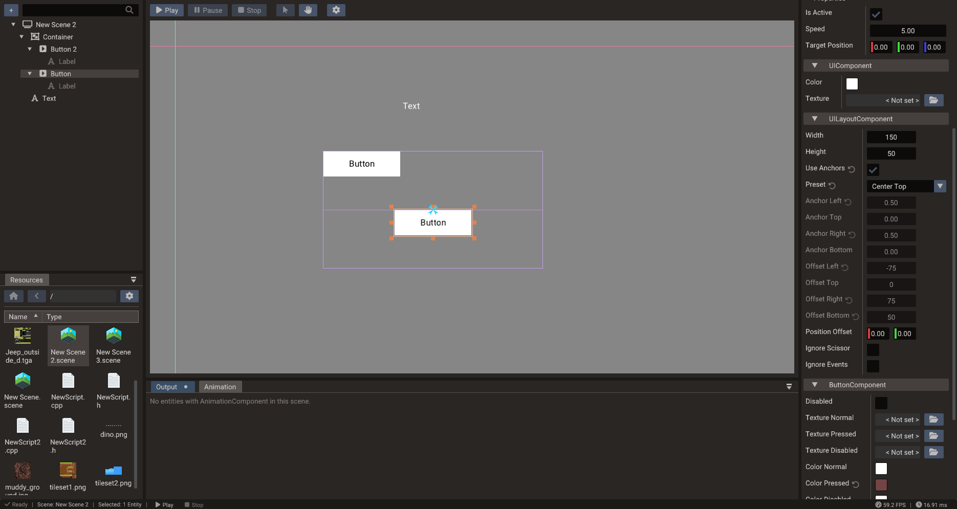
Anchors and layout
Every UI element inherits from UILayout which exposes an anchor system for
resolution-independent placement. Anchors define how an element is positioned and sized
relative to its parent.
Anchor presets
Use anchor presets for the most common layouts:
Image logo(&scene);
logo.setAnchorPreset(AnchorPreset::CENTER);
logo.setTexture("ui/logo.png");

Image header(&scene);
header.setAnchorPreset(AnchorPreset::TOP_WIDE);  // stretches full width at the top
Available presets include TOP_LEFT, TOP_CENTER, TOP_RIGHT, CENTER_LEFT,
CENTER, CENTER_RIGHT, BOTTOM_LEFT, BOTTOM_CENTER, BOTTOM_RIGHT, LEFT_WIDE,
RIGHT_WIDE, TOP_WIDE, BOTTOM_WIDE, and FULL_RECT (stretch to fill parent).
Manual anchors
For precise control, set the four anchor points directly. Anchor point values range from 0 (left/top of parent) to 1 (right/bottom of parent):
widget.anchorPointLeft   = 0.25
widget.anchorPointRight  = 0.75
widget.anchorPointTop    = 0.0
widget.anchorPointBottom = 0.5
Building UI in code
In Lua, anchorPreset and a widget's text/label are properties; parenting is done by
calling addChild on the parent. Button click handlers live on the ButtonComponent
(onPress / onRelease).
scene = Scene()

-- Background panel
panel = Panel(scene)
panel.anchorPreset = AnchorPreset.CENTER
panel:setSize(400, 300)
panel:setTexture("ui/panel_bg.png")

-- Label
title = Text(scene)
panel:addChild(title)
title.anchorPreset = AnchorPreset.TOP_CENTER
title.text = "Game Over"
title.fontSize = 36

-- Button
btn = Button(scene)
panel:addChild(btn)
btn.anchorPreset = AnchorPreset.BOTTOM_CENTER
btn.label = "Restart"

local btnComp = btn:getButtonComponent()
btnComp.onPress = function()
    SceneManager.loadScene("Game")
end

Engine.setScene(scene)
Scene uiScene;

Panel panel(&uiScene);
panel.setAnchorPreset(AnchorPreset::CENTER);
panel.setSize(400, 300);
panel.setTexture("ui/panel_bg.png");

Text title(&uiScene);
panel.addChild(&title);
title.setAnchorPreset(AnchorPreset::TOP_CENTER);
title.setText("Game Over");
title.setFontSize(36);

Button btn(&uiScene);
panel.addChild(&btn);
btn.setAnchorPreset(AnchorPreset::BOTTOM_CENTER);
btn.setLabel("Restart");

btn.getComponent<ButtonComponent>().onPress = []() {
    SceneManager::loadScene("Game");
};
UI events and input
UI widgets receive pointer and touch events automatically. The Button fires onPress
and onRelease; TextEdit fires onChange when the text changes; Scrollbar fires
onChange with the new scroll value.
To prevent UI clicks from also triggering gameplay input (such as shooting when the player taps a UI button), call:
9-patch scaling
Image and Panel support 9-patch (nine-slice) scaling so borders remain sharp as
the widget resizes. Set the border insets to define the corner and edge regions that
should not be stretched:
Image frame(&scene);
frame.setTexture("ui/frame.png");
frame.setPatchMargin(12, 12, 12, 12);  // left, right, top, bottom pixel margins
frame.setSize(300, 200);
Containers
Container arranges its children automatically in a vertical stack, horizontal row, or
wrapped grid. This is useful for inventory grids, option lists, and toolbars where the
number of items changes at runtime.
list = Container(scene)
list.type = ContainerType.VERTICAL   -- type is a property; values: VERTICAL, HORIZONTAL, VERTICAL_WRAP, HORIZONTAL_WRAP

for i = 1, 5 do
    local item = Button(scene)
    list:addChild(item)
    item.label = "Item " .. i
end
Canvas size and scaling
The UI canvas size defines the logical coordinate space. Set a fixed canvas size that matches your design resolution and choose a scaling mode:
| Scaling mode | Behavior |
|---|---|
FITWIDTH |
Scale to fit the horizontal axis; may letterbox vertically |
FITHEIGHT |
Scale to fit the vertical axis; may letterbox horizontally |
LETTERBOX |
Fit inside the screen maintaining aspect ratio |
CROP |
Fill the screen, cropping edges |
STRETCH |
Stretch to fill (may distort) |
NATIVE |
Use actual screen pixel resolution |
Canvas size and scaling are configured on the global Engine, not on the scene:
See Multiple Resolutions for the full scaling guide, including how to keep the UI crisp over a scene that uses a fixed render resolution.
Practical guidance
- Design against a fixed canvas size (e.g. 1920×1080 or 1280×720) for predictable layouts across screen sizes.
- Use anchor presets wherever possible; reserve manual anchor values for non-standard layouts.
- Separate HUD, pause menu, and modal dialogs into different root containers or separate UI scenes.
- Keep UI textures and fonts organized in a dedicated asset folder.
- Use
Containerfor lists and grids so the layout adjusts automatically when items are added or removed. - Test UI scaling on the target aspect ratios early in development.